💼 User Experience & Marketing Writing Portfolio
🛠 Experience & skills
Catchy headlines
Marketing copy
Product descriptions
Information Architecture
Navigation
User journey flows
UX microcopy
📜 On this page
🔮 Delphia website
WHAT: A new website for Canadian AI startup Delphia
WHY: Encourage investors to join Delphia and share their online activity data, thus becoming a part of the dataset the investing AI uses to attempt to beat the market.
HOW: Create an unusual, offbeat brand that stands out in the crowded space of investment startups. Also, talk about a complex new product category so anyone can understand and trust it — without using the nearest comparable term, “robo-advisor," which was quite a challenge.
MY ROLE: As content design lead I led content strategy, managed a part-time copywriter, facilitated stakeholder interviews to understand the product, wrote UX and marketing copy, and made product decisions with Delphia's CEO and COO and the EY Design Studio team.
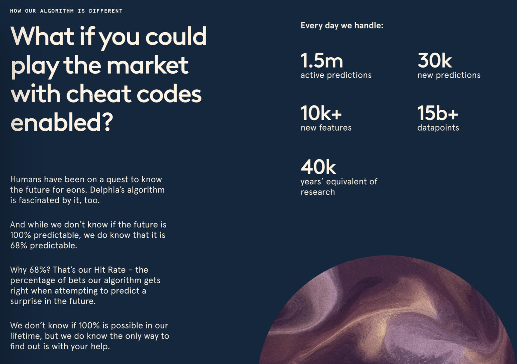
Sample copy from the product explaining how accurate Delphia's tech could be
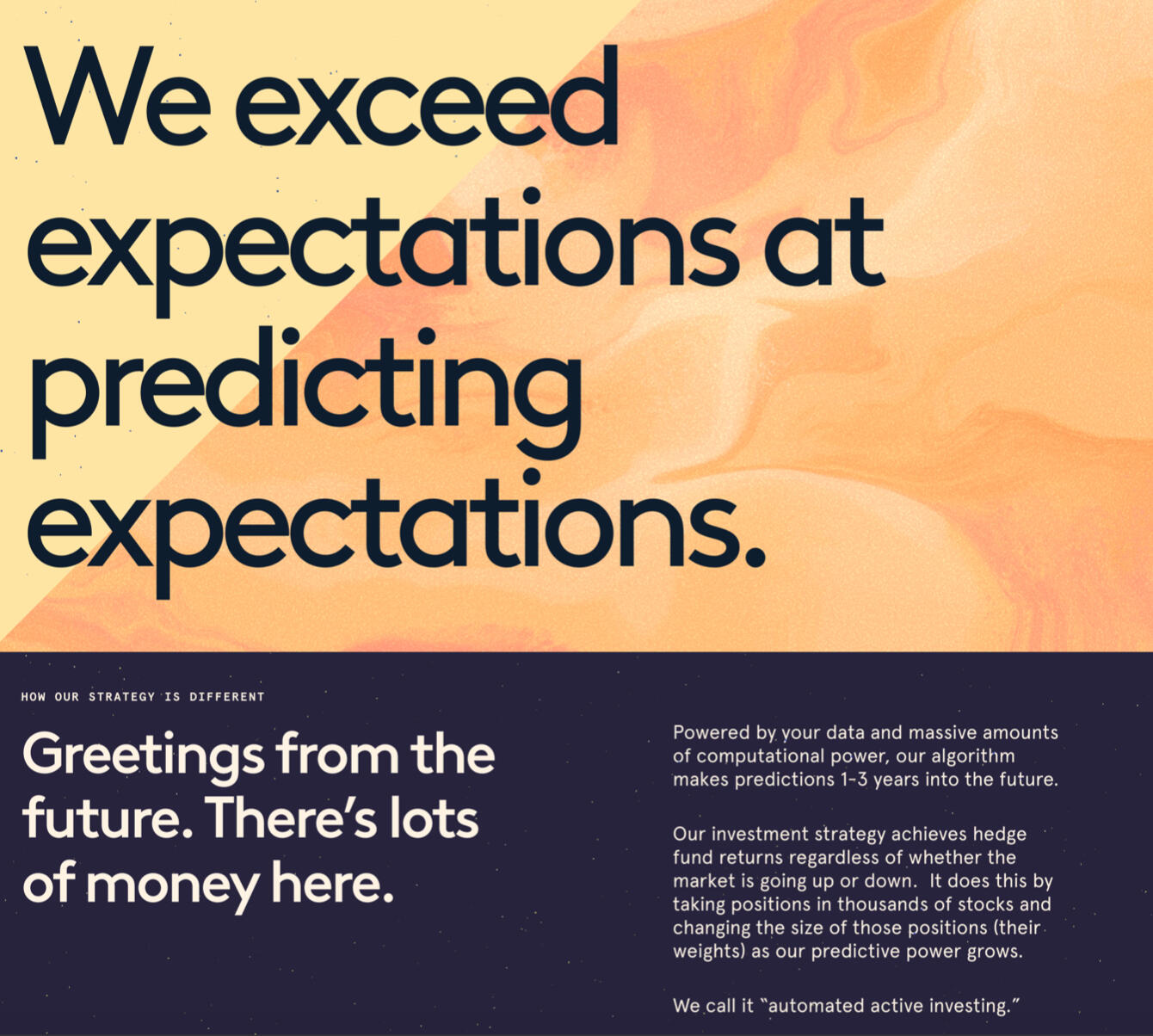
Website content describing the new product category Delphia aims to create
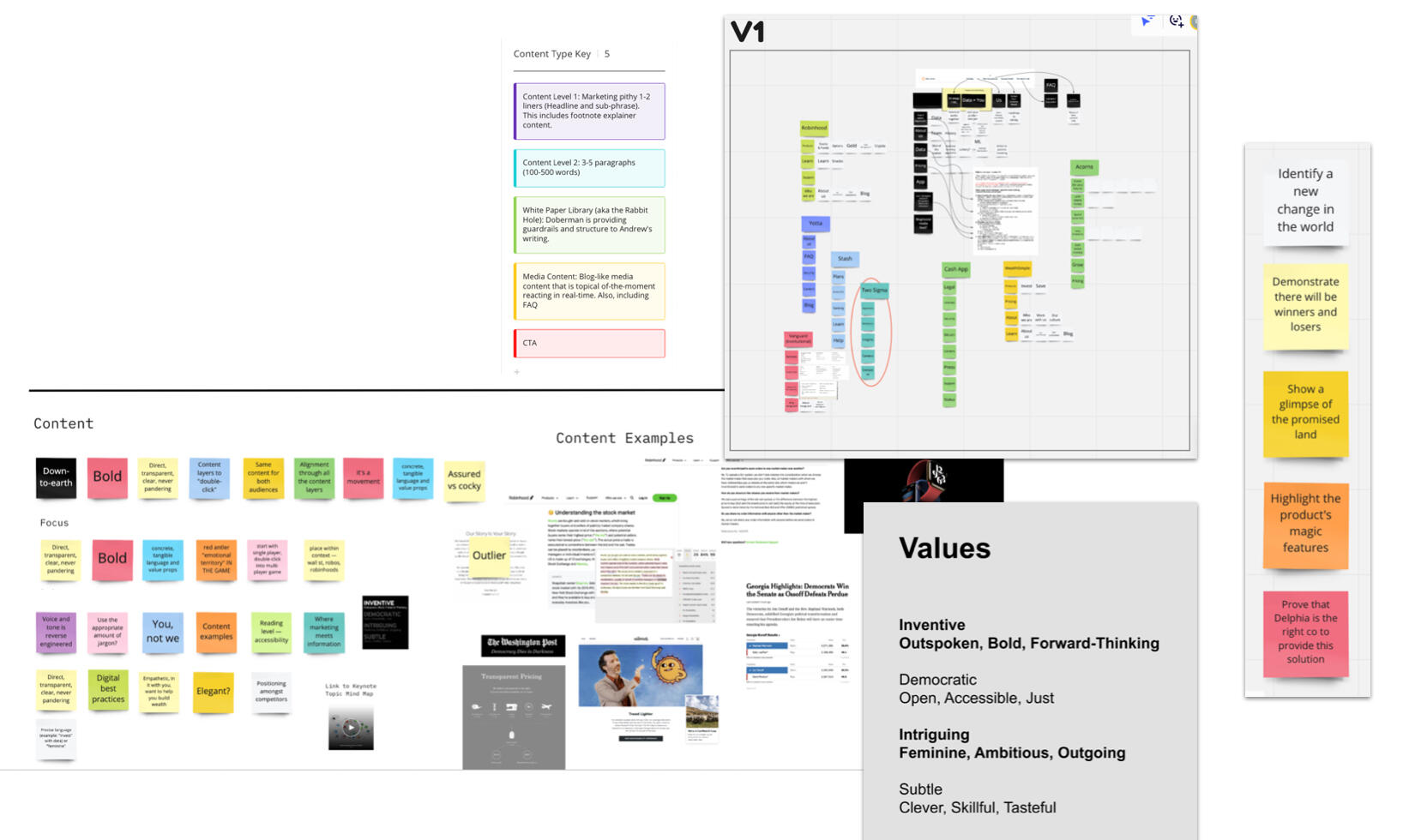
Delphia kicked off the project assuming they had everything to proceed with content, though they were missing some key strategic guidance documents. As Lead Content Strategist, I had to educate stakeholders quickly and facilitate workshops to create missing documentation. This is a visual montage of a few sample activities I led to create navigation, tone of voice, brand values, as well as a consistent but flexible 5-beat page sales structure.
PROCESS:
Delphia's CEO said "You're the best copywriter I've ever worked with!" While that feedback was affirming, it was also vital information — it signaled I had achieved alignment with a key stakeholder and had his trust to write in the voice and tone of his company.
The strategic activities I facilitated in the initial phase of the project laid the foundation for this success.
A mobile sales video I wrote, art directed, and guided voice casting for
DELIVERABLES:
Strategic documentation, including tone of voice, values, information architecture and navigation, and repeatable page structure
Website
Marketing video
🏦 Brighthouse Financial website
WHAT: A new website for Brighthouse Financial, a new company created when MetLife spun off their life insurance and annuity business.
WHY: Explain the value of life insurance and annuities in simple, clear language for an older, less digitally-savvy target market
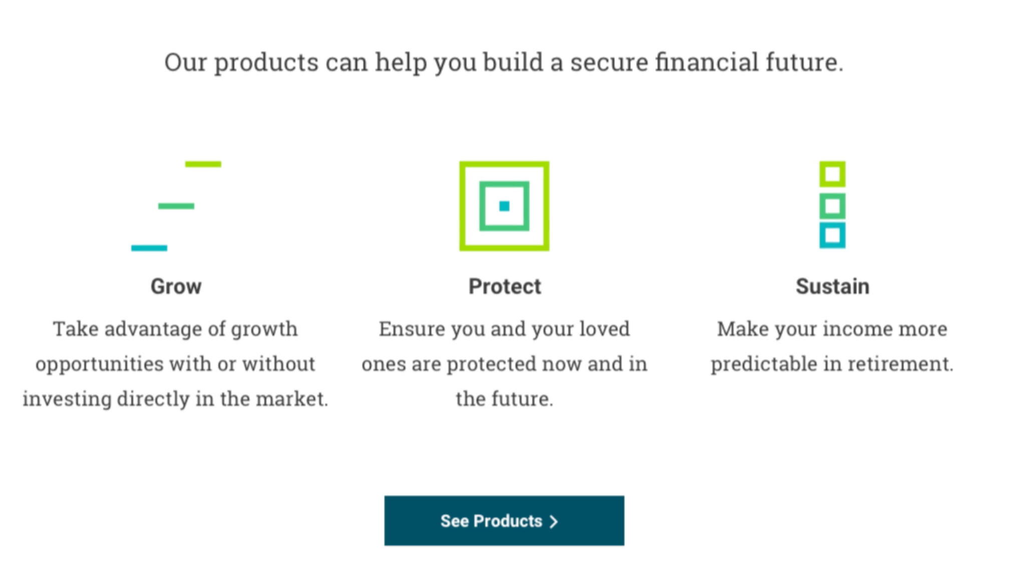
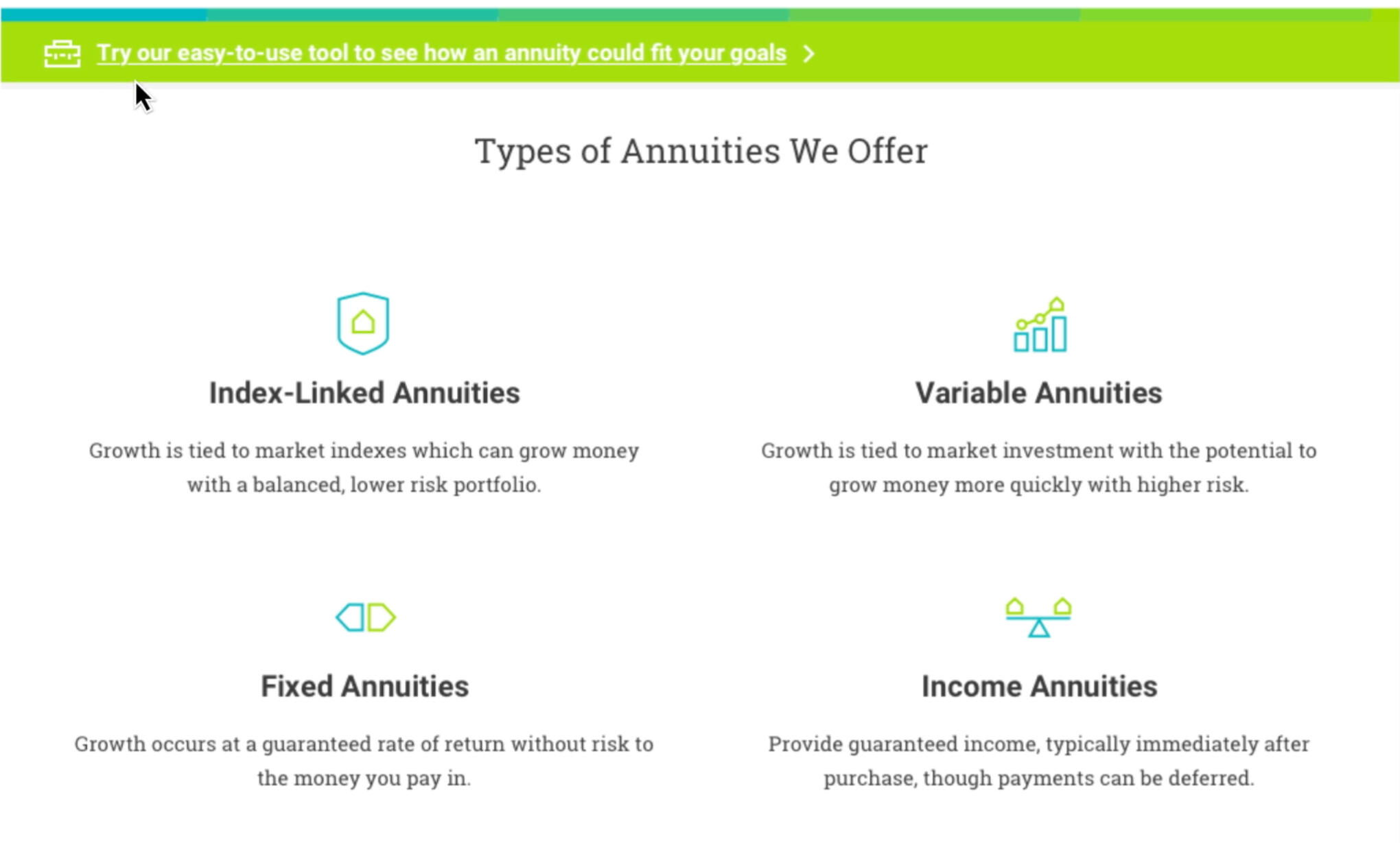
HOW: Create a simple journey from general to specific information, as well as easy-to-understand tools to help users find the right products for them.
MY ROLE: As content design lead I led content strategy, facilitated workshops to create content standards with the client, designed content-first user flows, wrote UX microcopy, and made product decisions in collaboration with the design team. I also conceived and wrote the product selection tools.
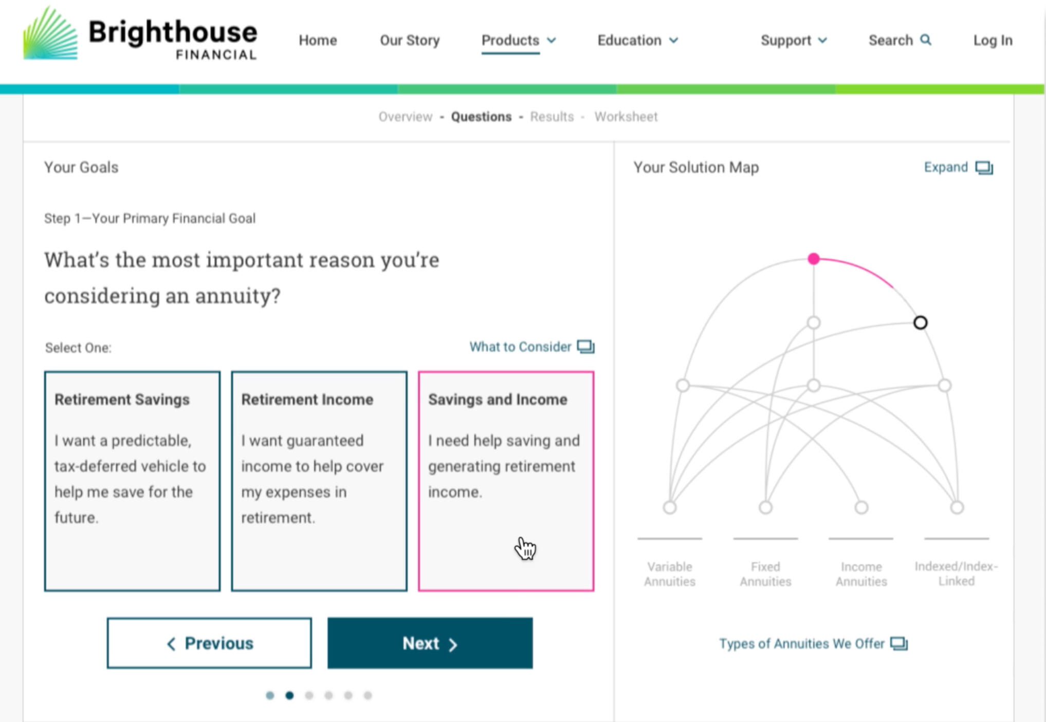
The annuity selection tool I concepted and wrote with a design partner.
Simple layouts with strict word counts helped the site feel fresh and usable.
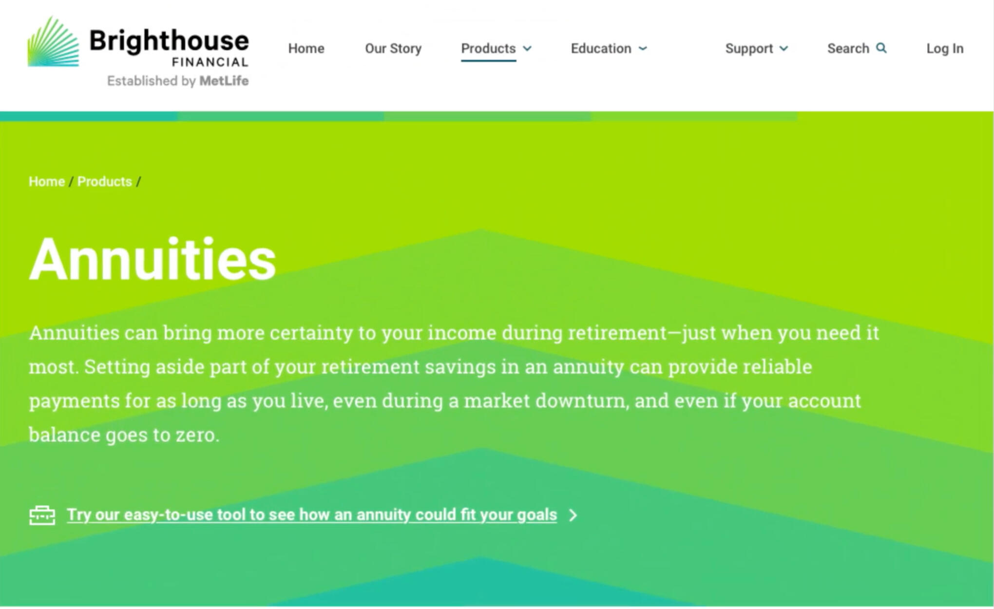
One of the challenges I enjoy about creating content for highly regulated industries is creating simple, easy product content that follows compliance rules, as this hero I created for annuities illustrates.
We created this video to explain — but also sneakily celebrate — the work we did with the Brighthouse team. It shows how the content works in the design to create a simple experience that grows in detail.
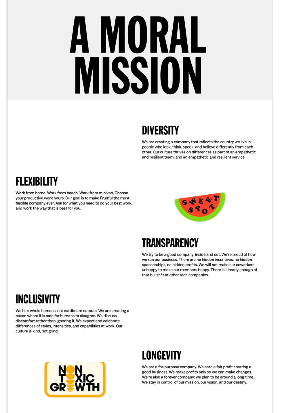
🍒 Fruitful website & app
WHAT: A website, app, and service design for a subscription financial advising startup.
WHY: Create a brand language that stands out in a crowded space and draws in our target audience.
HOW: Find fun, striking ways to talk about traditionally dull financial topics — while keeping our Chief Compliance Officer happy (in fact, she and I were great partners).
MY ROLE: I created the customer-facing tone of voice, directed all the content, and created much of it myself as a content department of one. In addition to the customer-facing website and app, I also concepted and created content for the careers page, the app, and program materials for beta users.
A walkthrough of the customer-facing website. I wrote or gathered and edited all the content.
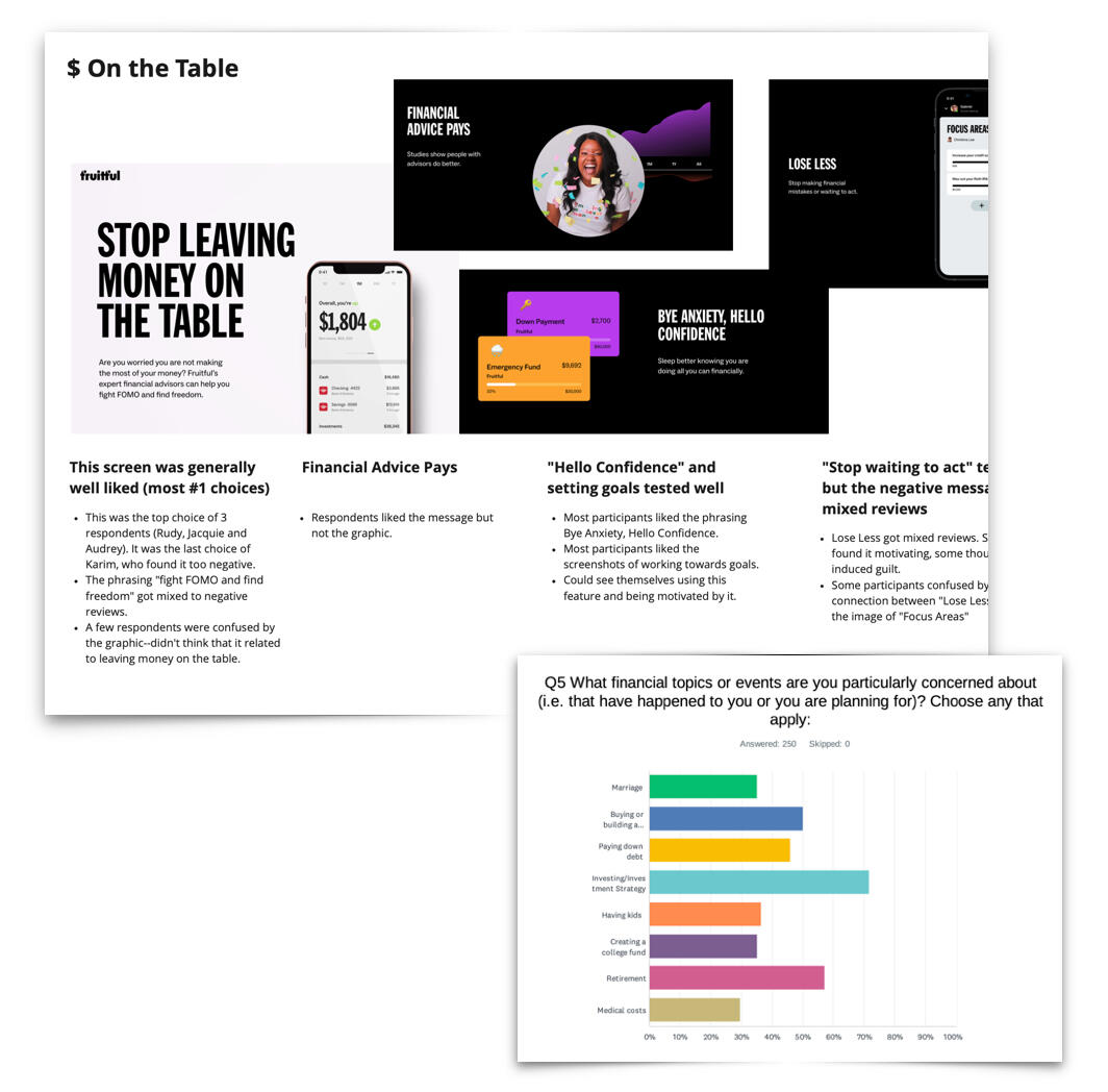
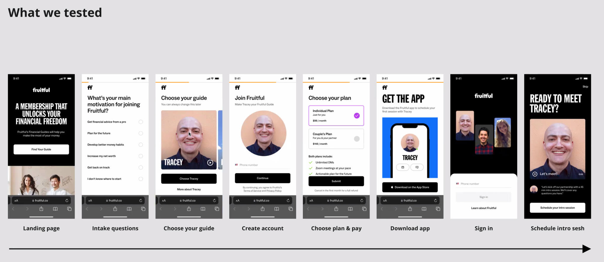
I worked with designers to test content, both qualitatively and quantitatively — and recruited and trained other employees to help speed up the testing while maintaining quality.
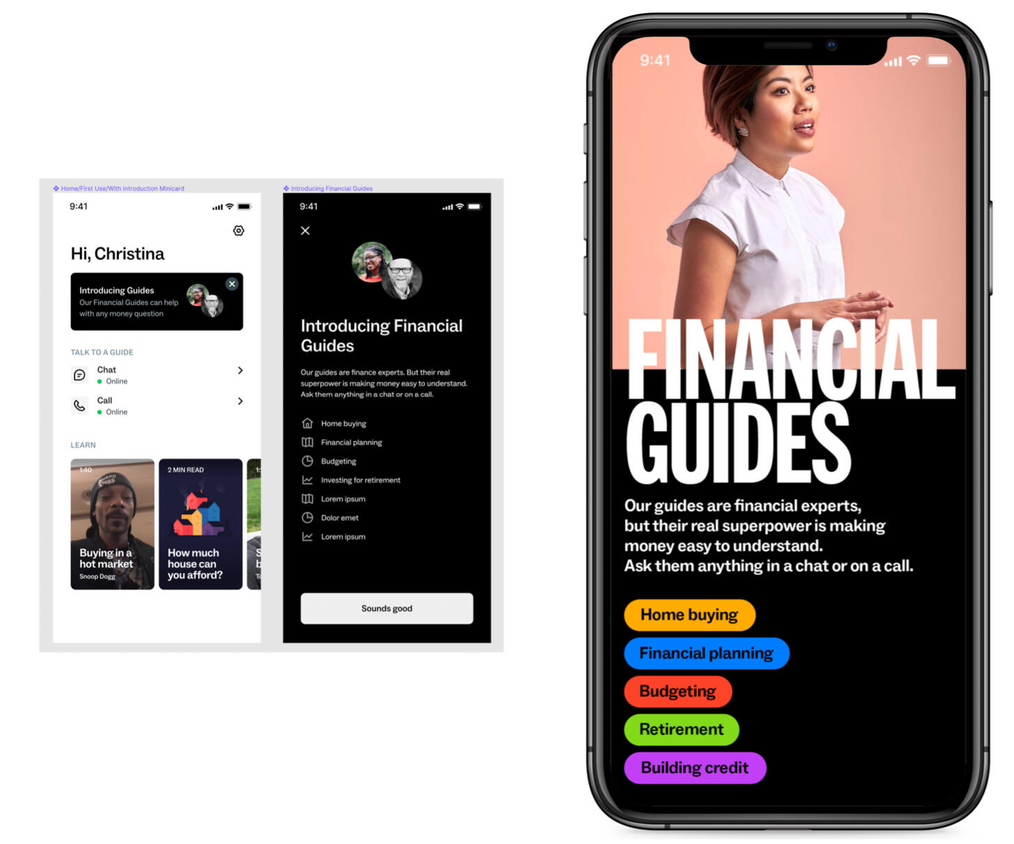
For the logged-in membership area of the app, I developed a taxonomy of financial topics to connect other topics and related content.
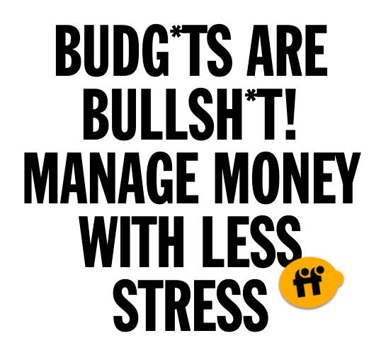
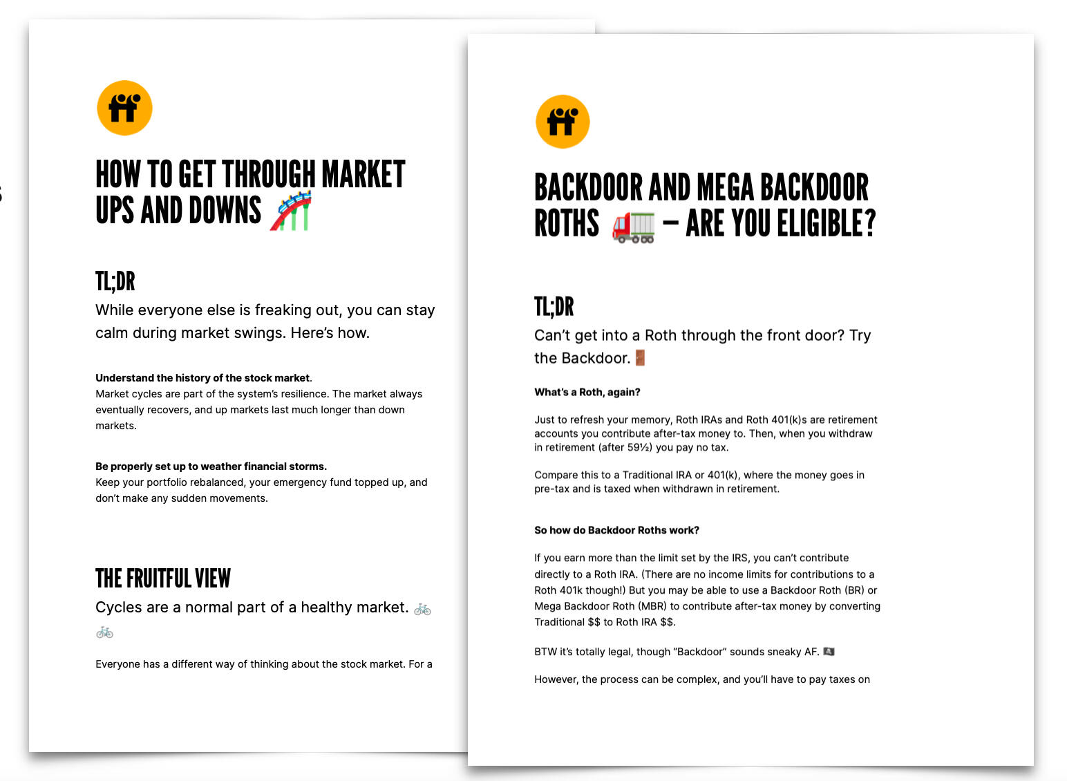
One of the perks of membership was these "info sheets" that explained complex, relevant financial topics — such as budgeting and investing — in simple, accessible language to appeal to a younger audience.
For a startup in hiring mode, content for future employees was nearly as important as customer-facing content. I created the hiring page — including the "fruit sticker" content — which was often mentioned positively during the interview process.
📨 Cigna email audience test
WHAT: A series of emails I wrote with the same message delivered in different tones of voice for various client personas.
WHY: Test and improve open, read, and click-through rate of targeted emails vs. control. Cigna's Compass healthcare program had launched a new app they wanted their members to download. They weren’t getting a great response to the existing campaign, which sent the exact same email to every member.
HOW: Write completely different emails that communicated the same content, focusing on key concerns of each audience group. The key messaging was the same, but everything else, from the preheader to the CTAs, was targeted.
MY ROLE: I worked with our client contact to write and approve the content, and art-directed a designer to create targeted yet on-brand designs for each email.
BUSINESS VALUE: Test and learn to increase the rate of response with email recipients, encouraging customers to download a new app they might not have yet heard of and connect with Cigna in a deeper way.
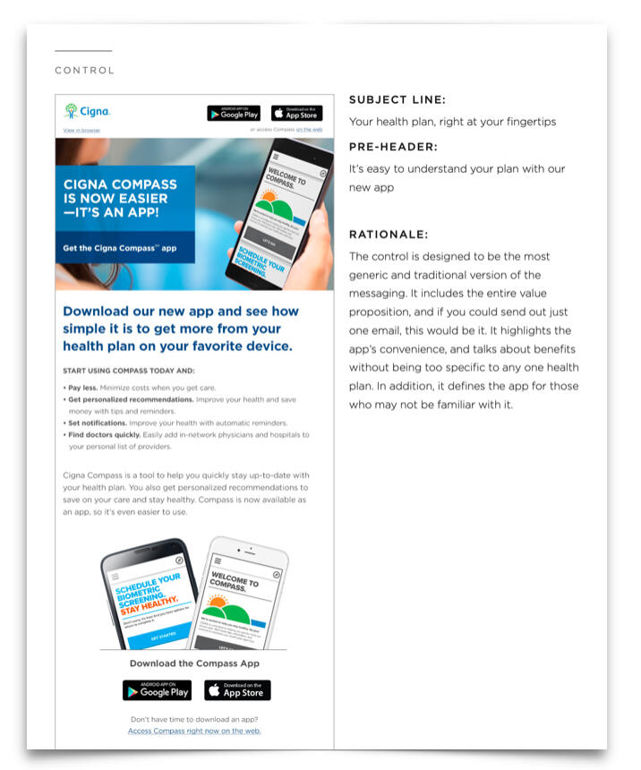
The control email. It contained all the information that needed to be communicated, in a generic tone of voice that matched existing Cigna comms.
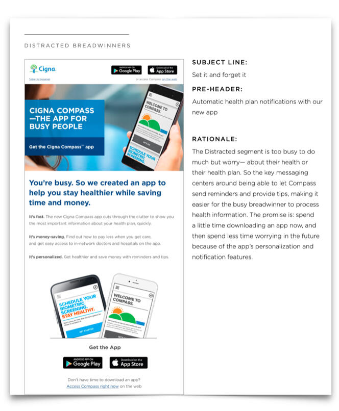
The email aimed at "distracted breadwinners" designed to be concise and easily scannable.
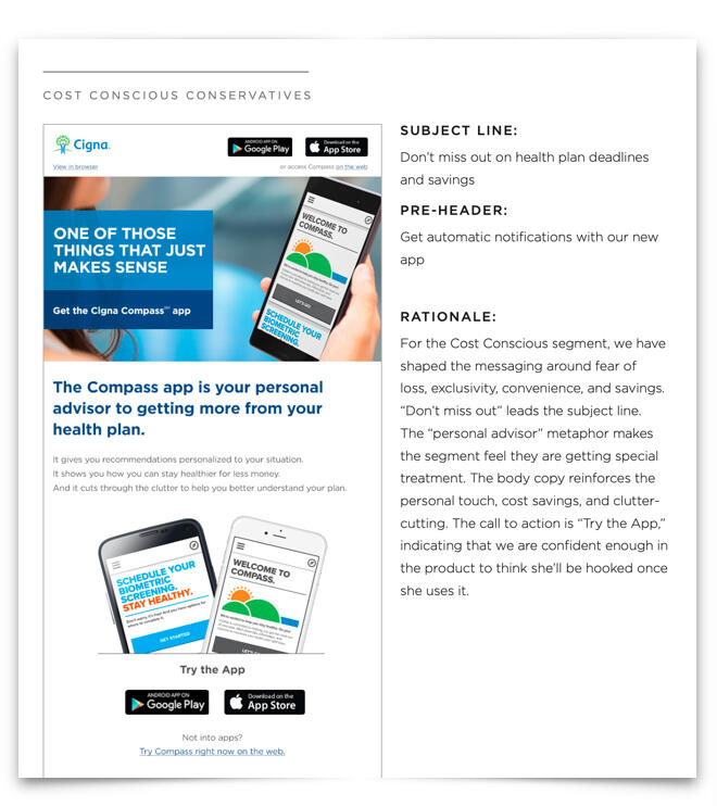
The email aimed at "cost-conscious conservatives" designed to appeal to their desire to save money and improve their healthcare in an easy, additive way — not upending their current ways of doing things.
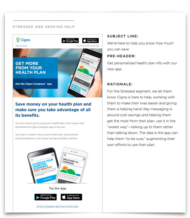
The email aimed at consumers "stressed and seeking help" designed to reassure them and draw them in by promising the help and guidance they're looking for.